Mike Burk
November 15, 2014
Share on facebookShare on twitterShare on google_plusone_shareShare on stumbleuponShare on emailShare on printMore Sharing Services0
The good news is: The S&P500 (SPX) closed at an all time high and the NASDAQ composite (OTC) closed at a multi year high on Friday.
The negatives: The major indices continued to move upward, but new lows and downside volume have remained uncomfortably high.
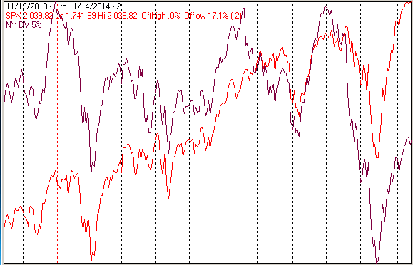
The chart below covers the past year showing the SPX in red and a 5% trend (39 day EMA) of NYSE downside volume, (NY DV) in maroon. NY DV has been plotted on an inverted Y axis so decreasing downside volume moves the indicator upward (up is good). Dashed vertical lines have been drawn on the 1st trading day of each month.
NY DV is still lower than it has been most of the time during the past year as the SPX hit an all time high.
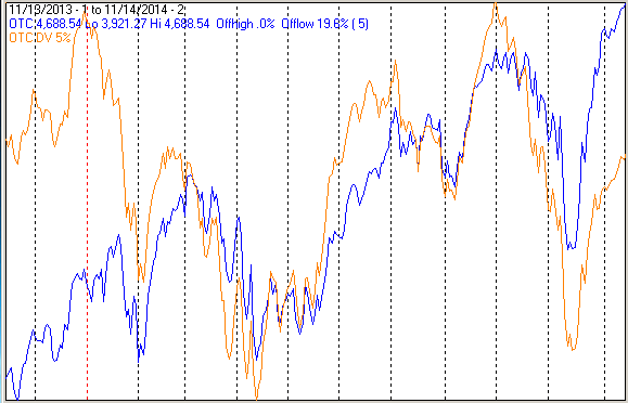
The next chart is similar to the one above except is shows the OTC in blue and OTC DV, in red, has been calculated from NASDAQ data.
OTC DV, although a little stronger than NY DV, is at a relatively low level while the index is at a new high.
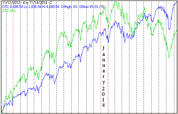
Advance – Decline lines (ADL) are a running total of declining issues subtracted from advancing issues.
The next chart covers the past 2 years showing the OTC in blue and an ADL calculated from NASDAQ issues (OTC ADL) in green.
Around March of this year the OTC ADL changed from an uptrend (higher highs and higher lows) to a down trend (lower highs and lower lows).
The positives: New highs and new lows have held at comfortable levels.
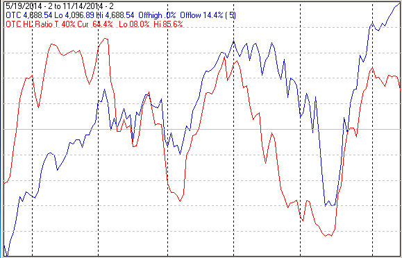
The next chart covers the past 6 months showing the OTC in blue and a 40% trend (4 day EMA) of NASDAQ new highs divided by new highs + new lows (OTC HL Ratio), in red. Dashed horizontal lines have been drawn at 10% levels of the indicator, the line is solid at the neutral 50% level.
OTC HL ratio fell a little last week, but remains at a positive 64%.
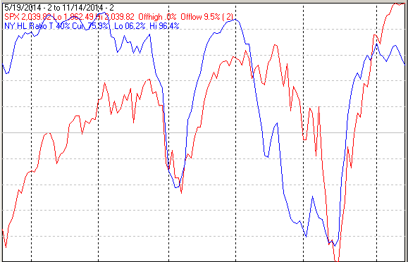
The next chart is similar to the one above except is shows the SPX in red and NY HL Ratio, in blue, has been calculated from NYSE data.
NY HL Ratio also fell a little last week but remains in comfortably positive territory.
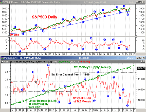
Money Supply (M2)The money supply chart was provided by Gordon Harms.
M2 growth declined sharply last week.
ConclusionThe continued elevated levels of downside volume and new lows is a little troubling. That along with lagging secondaries make the recent market activity look more like a developing top than a bottom following a completed cycle.
I expect the major averages to be lower on Friday November 21 than they were on Friday November 14.


 发表于 2014-11-19 12:10
|
发表于 2014-11-19 12:10
| 


